SMEs Share Insights on Their Logo Shapes
This article is based on a survey conducted by Front Signs. Out of more than 100 SME respondents, we’ve filtered the most relevant answers and presented them below.
Table of contents
-
- 1. Oval Shaped + Lettering – Candid Owl Limited
- 2. Letter Shaped + Waves – Act Audio
- 3. Fig Shaped – Real FiG Advertising + Marketing
- 4. Letter Shaped – Parental Questions
- 5. Graphic Shaped – MoneyNerd
- 6. Circle Shaped – Infinity Dish
- 7. Symbol Shaped – Tenzo Tea
- 8. State Shaped – We Buy Houses In Pennsylvania
- 9. Letter Shaped – Gadget Review
- 10. Peach Shaped – Peachy Home Buyers LLC
- 11. Graphic Shaped – RoverPass
- 12. Symbol Shaped – Net Lawman
- 13. Leaf Shaped – Garden Furniture
- 15. Graphic Shaped – WikiLawn
- 16. Circular Shaped – The Seidel Agency
The shape of your logo is a significant factor in the success of your business signs. Explore the shape selections of the logo signs below and see how they match up to your own ideas.
1. Oval Shaped + Lettering – Candid Owl Limited
Our business logo is oval in design, with the lettering and an owl forming the shape of the main logo. The front signage for our business premise has additional lettering to describe the nature of our business.
Candice Small, Director
Adorn the facade of your premise with outdoor signs and captivate your audience.
2. Letter Shaped + Waves – Act Audio
My business logo is not as simple as just a letter or two, as we used our entire name. We do 12 volt electronics and safety which consist of mostly audio in vehicles. We kept the logo as our name with some sound waves coming out on both sides. I feel this keeps it easily recognizable, modern looking and relevant to what we do. I also like that when people see it they clearly know who it is and what it stands for as they’re not trying to figure out what the letters represent.
James Smith, Business Representative
The most elegant way to present the name of your business is with channel letters.
3. Fig Shaped – Real FiG Advertising + Marketing
We designed our logo to be in the shape of a fig fruit because we knew that it would be the perfect synonymous image to associate with our company. Even since our company was founded, we’ve always relied on a fig fruit as our logo simply because it works so well with our company name.
Niles Koenigsberg, Digital Marketing Specialist
4. Letter Shaped – Parental Questions
I chose the logo that emphasizes the name of the brand of my website to actually attract the leads or prospects. I talk about parenting so when the users search for something related to the topic, the logo will already give them an idea about the subject of my brand.
Mo Mulla, Founder
5. Graphic Shaped – MoneyNerd
The MoneyNerd logo is the shape of an ‘O’ in the trading name ‘M*o*neyNerd’. This means we have two logos in one. One is simply a round head with glasses which we use for advertising, social media posts and on YouTube. That smaller logo makes up the ‘O’ in our bigger, more official/less subtle logo ‘MoneyNerd’.
This wasn’t intentional when I first thought of the logo. I just found the URL was available when looking for a money expert. Then over time, the smaller, individual logo became quite trendy and hipster almost. I feel like that captures our internet brand as well as representing many of the customers who use our online debt calculator. So it all ties in quite nicely.
Scott Nelson, CEO
6. Circle Shaped – Infinity Dish
My company does not have a business logo in the shape of a letter because we found that incorporating the entire business name gave us better recognition online and on the street. We played with our design for years until we hit the sweet spot – but that doesn’t mean it will never change again. The outer circular design has also helped us stand out against other companies who have chosen other shapes.
Laura Fuentes, Operator
7. Symbol Shaped – Tenzo Tea
Our logo strayed away from the use of lettering and words. Tenzo focuses on a symbol to give a nice and aesthetically pleasing presentation that catches our customer’s eyes. Much like the Apple logo, ours is created in a way to give diversity to our look.
Steve O’Dell, Co-Founder and CEO
8. State Shaped – We Buy Houses In Pennsylvania
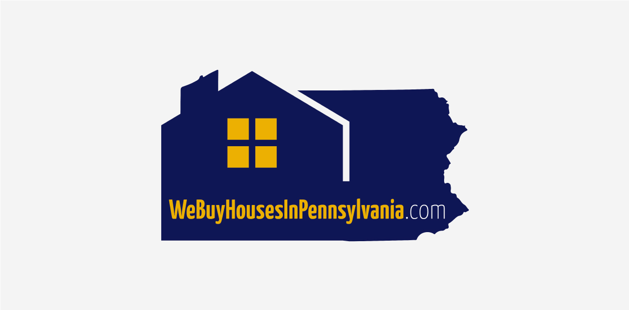
My logo is in the shape of a state! My business is in a very competitive niche so I decided to be unique and make my logo the shape of the state of Pennsylvania since that’s the territory I cover. It really gets me noticed whether it’s on fabric (eg. polo shirt), billboard or digital media.
Ryan David, Owner
Lightbox signs are an excellent medium for highlighting the custom shape of your logo.
9. Letter Shaped – Gadget Review
Our current logo utilizes full text in a tech font with an underscore following the company name to simulate it being typed into a console. We want visitors to be able to associate our full name with our site so that they can easily remember it as a source of reliable product reviews. For this reason, we’ve chosen not to go with an abbreviation or any kind of icon. The only time this rule is broken is for the site’s favicon, and that’s an obvious place to condense as much as possible.
Rex Freiberger, CEO
10. Peach Shaped – Peachy Home Buyers LLC
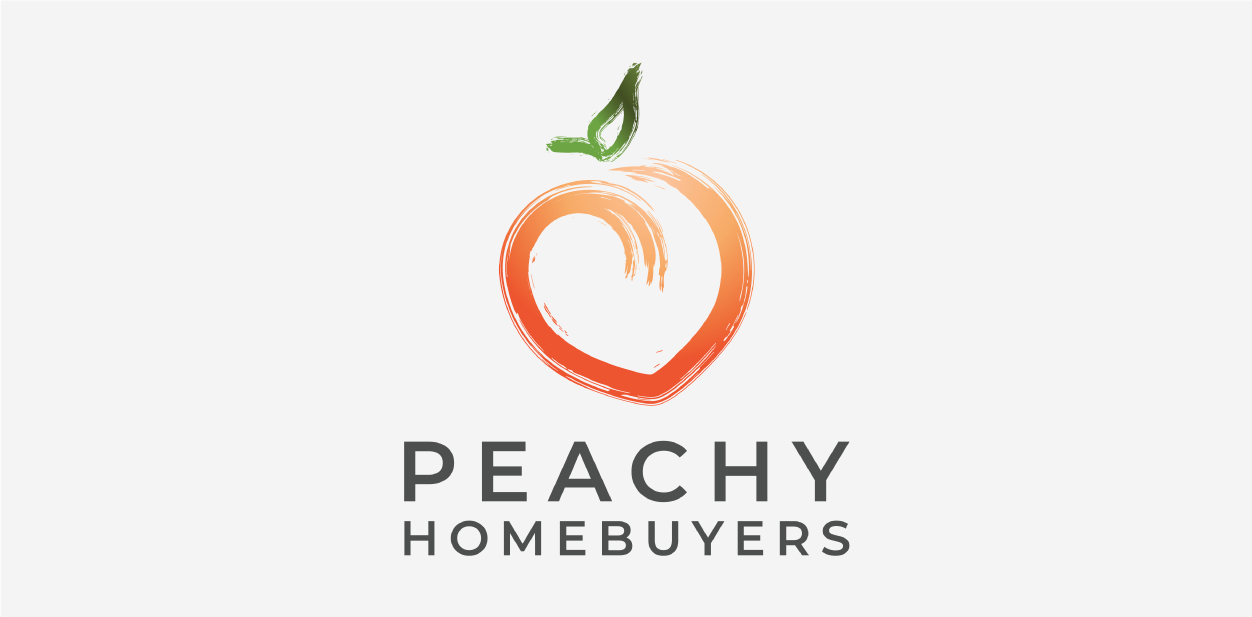
The Peachy Home Buyers logo was indeed designed to be in a recognizable shape – a peach! We wanted the logo to represent the name accurately and vice versa. In our vision, it only made sense to design the logo after the peach fruit itself. It’s fun, bold, yet identifiable. We thought about what would catch the attention of not only real estate professionals but other industry experts in order to grow the company’s awareness. The peach is a recognizable shape and object and may spark the curiosity of what type of business it is fitted with. Additionally, it is not as common to have a logo such as ours in the field of real estate. We wanted it to stand out and be unique to showcase our personalities.
Debbie Liu, Owner
Property buying wouldn’t be the same without yard and real estate signs which are more versatile than you may imagine.
11. Graphic Shaped – RoverPass
We went with an image: a cartoon image of a camper. Since RoverPass is a booking service for RV sites and campgrounds, we felt it was best to have a logo that represented that immediately. We are in a niche market – there isn’t another service that does exactly what we do. While our name implies wandering or traveling, we wanted our logo to leave no doubt about exactly what our website visitors would get from us.
Ravi Parikh, CEO
12. Symbol Shaped – Net Lawman
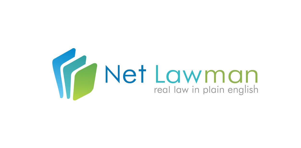
The logo is symbolic in colour and in design, with the image being simply three pieces of paper – representing what we do. The papers themselves are blank, both for simplicity and also to show ‘what is to be written.’ A symbol of hope, expectations and clarity. Three were chosen to show complexity. There is always more to our work together and we are here to provide depth to your needs. Many of our clients are uncertain about what they need or where they need to go in their endeavours. We can guide them with that.
Andrew Taylor, Director
13. Leaf Shaped – Garden Furniture
My logo is In the shape of a leaf.
At the year I started my business, there weren’t many people to support the business logo so I simply chose leaves to replicate the nature in my business name.
After a few years, people see the logo as a symbol of quality.
Andy Griff, CEO
14. Rectangular Shaped – Chilli Fruit Web Consulting
I spent quite a bit of time thinking about my logo as I wanted something that was really clean and clear. A lot of people make the mistake of getting too fancy with their logo and end up with something which is confusing. For this reason, I chose a simple rectangular shape with clear text and no images. The result is a really clean logo which my research tells me is easily recognizable. The other benefit of keeping the logo simple is that it works throughout my digital and physical presence.
Milosz Krasinski, Managing Director
15. Graphic Shaped – WikiLawn
We went with a graphic logo showing a lawnmower and a freshly manicured lawn. We wanted something that would instantly communicate our services and our initials don’t do that. We also worried full lettering would be too much. So the logo just represents our industry, essentially, and helps to pull people in.
Dan Bailey, President
16. Circular Shaped – The Seidel Agency
Our Motto is to “Do Good. Give Back and Make an Impact.” What goes around, comes around, so our logo is a circle. The circular design also represents 360 marketing.
Steve Seidel, Founder
17. Fox Shaped – Foxtrot Marketing
We are Foxtrot Marketing Group, formerly 20/20 Brand Solutions. We create online company stores and promotional product programs. Our logo is a fox to represent our new brand story and promise.
Jenna Jackson, Marketing Coordinator
Find out how your logo and overall branding strategy can complement one another.
Let’s Sum It All Up
We can drive some statistics from the overall survey results which included more than 100 respondents. Want to know what shape is the most popular for logos? Let’s have a look:
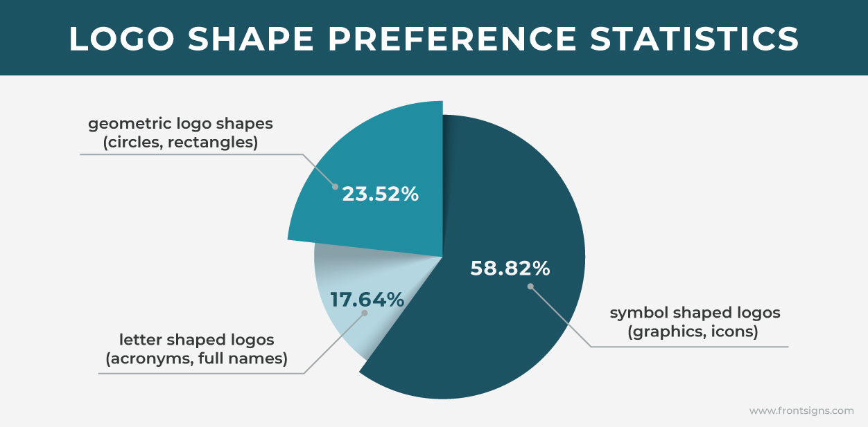
As you can see, the majority of respondents favor symbol shaped logos. Geometric logo shapes took second place and letter shaped logos came in last. What’s your top pick?
