14 SMEs Explain Their Logo Colors
This article is based on a survey conducted by Front Signs. It’s a collection of replies about logo colors and the reasoning behind each choice. Out of more than 100 respondents, we’ve filtered the most relevant answers and presented them below.
Table of contents
-
- 1. Hue of Pink – Team Building
- 2. White/Grey with Heightened Teal/Green – Gravy
- 3. Gold, Blue & A Bit of White – We Buy Houses In Pennsylvania
- 4. Green-Grey & Grey – The Center for Cultural Studies & Analysis
- 5. Mix of Blue & Yellow – GyanDevign Tech Services LLP
- 6. Shades of Oranges & Greens – Peachy Home Buyers LLC
- 7. Purple Combined with Orange – Leslie Saul & Associates, Inc.
- 8. Paradise Pink – Better Proposals
- 9. Yellow, Navy Blue & White – Remote Bob UK
- 10. Purples & Blues – Stabili-Teeth™
- 11. Blues, Greens & Black – Netlawman
- 12. Orange and Blue – Talk Travel
- 13. Red – Cardinal Digital Marketing Agency
- 14. Deep Blue – The Seidel Agency
- * Bonus Logo Color tip – FiveBarks
The content is intended to guide you along the process of choosing your business signs. Check the logo signs presented below to draw inspiration.
1. Hue of Pink – Team Building
We have a wide variety of logos between our parent brand and sub-brands. Our sub-brands tend to be more elaborate and colorful, so for our parent brand we wanted something simple and bold. We chose a hue of pink (#FF0083) that has some great advantages. First, it’s a unique color for our industry. Most of our competitors use shades of blue to align with a corporate audience, so our pink stands out. The color is also cheerful and playful, together with the logo shape, which is aligned with our brand image.
For in-person and client interactions, we use the logo in a number of ways — including on tee shirts and banners that we post at events. We actually use two color versions of our logo in these cases. Our default is still pink, since it keeps a consistent brand image, but we also convert it to plain white when we have a dark background, like a navy blue shirt. The advantage of having only one color is that it is easy to switch to variants like this.
Michael Alexis, CEO
Ready to host your own event? Knock it out of the park with gorgeous event signs.
2. White/Grey with Heightened Teal/Green – Gravy
Our logo color scheme is white/gray with heightened teal/green. Green is the color of money and represents focus and energy. We want our clients to associate our logo and colors with relaxed but focused attention.
Our logo is also a message icon with dots, which represents a person ready and
replying. Our logo also stands out in billboards because we don’t use aggressive colors like red or yellow to highlight something.
Douglas Liantonio, Marketing Outreach Analyst
Contact us for guidance on what color schemes to go with for your own outdoor signs.
3. Gold, Blue & A Bit of White – We Buy Houses In Pennsylvania
The way I chose my business logo colors only happened because I couldn’t come up with a color that I thought would stand out to customers. Finally, I came up with the fantastic idea to choose the color scheme matching the state of Pennsylvania license plate. Those colors are gold, blue, and a bit of white.
Over the course of time, I’ve come to find out that my customers can easily spot my business and it’s familiar to them because they’re accustomed to seeing the same colors everyday when driving. I’ve received more than a few compliments from former customers that said I have a great logo and a unique color scheme. There is nothing that even resembles it in the cash home buying industry.
Ryan David, Owner

If you are into classic display colors, check our selection of white acrylic signage featuring company brand names and logos.
4. Green-Grey & Grey – The Center for Cultural Studies & Analysis
When we had our first logo design drawn up, our senior analyst said to the designer, “Make our brand look like money.” So this young designer took the color palette from the US Mint: green-grey and grey. Our compass rose is made up on that theme, and it’s worked fine for 25 years.
Margaret J. King, Ph.D., Director

5. Mix of Blue & Yellow – GyanDevign Tech Services LLP
Since the world is on mobile and that’s where the future buyers are, I shared my views with my logo designer and he suggested not going for fancy designs.
We wanted to showcase a product coming out via mobile interface. It came out well and most importantly clear enough for my prospects to understand. We used a mix of blue (professional) and yellow (creativity/winning attitude) color to create our brand identity.
Rahul Gulati, Founder

Your branding strategy starts with your corporate image so click on the link to get started with the basics.
6. Shades of Oranges & Greens – Peachy Home Buyers LLC
The color scheme of our logo comprises shades of oranges and greens, to represent a “peach.” We use our logo in person by creating embroidered t-shirts that we wear at events or meetings with potential clients. On the other hand, because of the pandemic, a lot of our business is held over the phone. That is why we went with a company name and color scheme that symbolizes a peach, as this helps others visualize what our brand/logo colors are without ever having to see it before.
Debbie Liu, Owner
7. Purple Combined with Orange – Leslie Saul & Associates, Inc.
I wanted a version of purple to represent creativity combined with a version of orange or gold to represent positivity. The original purple was closer to navy blue, while the newer version is more purple. The original dot was more coppery, while the newer version is orange.
Leslie Saul, President
Check it out – we also conducted a survey to inspire your logo font selection!
8. Paradise Pink – Better Proposals
Our logo is fairly simple and the main color is called paradise pink. We wanted a logo that is playful and shows off how much we stand out from the competition. At the same time, a good part of our target audience are designers, so it had to be something eye-catching and stylish. By combining a color rarely seen in our industry with a simplistic logo design, we were able to create a logo which is memorable and easy to use on a variety of different platforms.
Petra Odak, Chief Marketing Officer

9. Yellow, Navy Blue & White – Remote Bob UK
As Remote Bob’s biggest strength is its people, we chose to put Bob, the representation of our employee, on the logo. The silhouette of Bob is yellow. A bright colour resembling sunshine with which we wanted to communicate Remote Bob’s values: personal approach and that we always have our client’s back. In a way giving them warmth.
The name of the company – Remote Bob, is written in Navy Blue bold letters to exude reliability and trustworthiness which again communicates that our clients can leave their business in our hands knowing we will make results.
Yellow, Navy Blue and White are the colours of Remote Bob so sometimes, if the background is Navy Blue, the name of the company is written in bold white letters. This communicates transparency, calmness and good organization.
Barbara Maheshwari, CEO
Make the colors of your business name and logo luster with elegant channel letters.
10. Purples & Blues – Stabili-Teeth™
The color scheme for our business is purples and blues. Purple is such an eye-catching color that stands out easily. Blue is a calming color that is important in the health industry. Blue and green are typical colors found in health organizations, so purple definitely breaks up that norm for us versus our competitors.
Bari Medgaus, COO
The colors, types and applications of medical office signs are especially important for your clients.
11. Blues, Greens & Black – Netlawman
I have the name of our company ranging from the same colours: azure/ultramarine blue, into a turquoise through to a soft forest green, the same colours as the three ‘pieces of paper’ that we use as our company logo. Underneath, in plain black, we have our motto: “Real law in plain English.” The decision on these three colours was namely to describe professionalism and creativity.
Andrew Taylor, Director
12. Orange and Blue – Talk Travel
The color schemes of our logo are:
Orange: #D1A583 rgb (209,165,131)
Blue: #1C2E57 rgb (28,46,87)
Our logo colors were primarily based on:
a) Using minimal colors
b) Making it easier to see and understand
c) Highlighting travel as we’re a travel company
Saurabh Jindal, Owner

13. Red – Cardinal Digital Marketing Agency
The logo itself retained the same bold and striking red coloring of Cardinal’s brand, which matches perfectly with the agency’s mission of igniting client growth.”
Alex Membrillo, CEO
Your office signs can set the tone whether you want to create a space of focus, creativity or a combination.
14. Deep Blue – The Seidel Agency
Our deep blue color was chosen to represent Loyalty, Honesty, and American Pride as I’m from Philadelphia, PA. Not to mention, we started in the medical arena so blue is a prominent color there, too.
Steve Seidel, CEO & Founder
* Bonus Logo Color tip – FiveBarks
You can be bound by a brand’s colors at times, but you will also have the ability to experiment. The colors entice you in, bringing life to the illustration and providing additional background for the landscape’s form. However, keep in mind that a strong logo is adaptable and will still work in grayscale. I prefer to provide clients with a true single color version, using only black and negative space, in addition to a grayscale version.
Tammi Avallone, Managing Editor
Let’s Sum It All Up
The businesses surveyed all have a logo color scheme that’s well-defined. Each color is meant to achieve certain goals and convey specific characteristics unique to the brand. Still, they all share common goals when it comes to their overall design. They all want to achieve a logo that is:
- Distinguished and attractive
- Reflects the brand’s values and identity
- Evokes a specific feeling and association
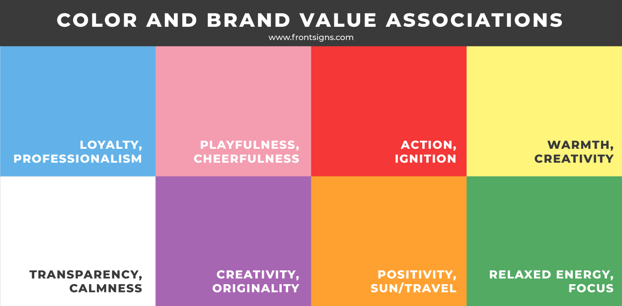
Please check out our “Color and Brand Value Associations” summary infographic. It’s been derived from the business response of the logo color survey we conducted.
Have you decided on your logo colors? We hope the explanations behind each choice in this survey have been inspiring to you. Contact us for expert guidance on the colors and overall logo design for your business signs. You’ll be assigned a personal project manager to discuss your vision and get a free consultation. We provide full-cycle sign making services including design, 3D rendering, manufacturing and installation.
